
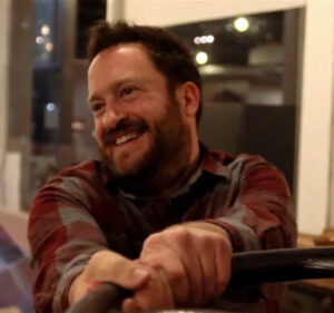
Hello! I’m David McNamara, the royal "we" of Publish Publish. If you combine my work as editor, designer, copy editor, indexer, production editor, proofreader, printer, and editorial director, I’ve worked on over 1,500 books.
The journey started in high school with bad poetry and punk rock zines. I’m of the age where a hand-held scanner was once of exorbitant price and, for reasons unknown even to me, I wanted one. For reasons also unknown to me, my father indulged me. This began an early foundation of understanding printer and digital DPIs, offset LPIs, and, ultimately, figuring out how to achieve what you want with less. Much like learning to print letterpress with a Kelsey Excelsior, inferior tools have their own special form of apprenticeship.
Speaking of letterpress, much like that handheld scanner, it appealed to me in ways I still don’t understand. The earliest known interaction I had with it was through Joshua Bodwell, who is now the editorial director at Godine, who graciously printed some bookmarks for an e-zine project I had started called sunnyoutside.
It would take a few years and a move from Seattle to Boston, but I would soon have that aforementioned Kelsey in my kitchen in a third-floor apartment on the Somerville/Cambridge line and sunnyoutside would become a small press publishing poetry and short fiction. Since then we’ve added a couple novels and a novella to our list, but it’s where I continue to explore the relationship between paper, ink, and language.
In that time, also aforementioned, I’ve filled a number of roles, but have staked my reputation on quality and knowing what the heck I’m doing—and, as often is the case, figuring out how to do more with less.
I’m a student of typography, from Tschichold to Binghurst, and I’m a print nerd, from digital to letterpress—and even Risograph. A favorite memory is a pilgrimage to famed Firefly Press where I mentioned to John Kristensen, proprietor, that I admired Bruce Rogers. In his magnificent Brahman, which so politely told you that you were wrong without admonishing you, John mentioned that I should check out D. B. Updike’s design and typography. “Rogers made books that are pretty to look at, but Updike designed books to be read,” he noted. Perhaps it was an admonishment after all—regardless, the message was clear.
In the time since, I’d like to think sunnyoutside books were both of those. But I’ve also worked on projects with tight budget restrictions, and those of hand-sewn, foil-stamped opulence. The short of it is I like making books, I like making books better, and I like printing things. If your project falls somewhere within that Venn diagram—or you just need some business cards, postcards, or yard signs printed—let’s talk. I’m at david@publishpublish.com.